
The Role of Colour and Finish in Creating Calmer Care Home Interiors
By Kathryn Lloyd, Colour Specialist, Crown Paints
Care home design is about more than how a space looks. Interiors need to feel familiar for residents, reassuring for families and practical for the staff using them every day.
Colour plays a key role in setting that tone, helping spaces feel welcoming, homely and considered. In busy nursing and residential settings, the finish matters just as much. The right paint specification ensures carefully-chosen schemes can withstand daily use, regular cleaning and ongoing maintenance.
Moving away from clinical spaces
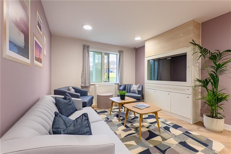
 Care homes are working environments, but they are also people’s homes. A considered colour scheme can soften spaces that might otherwise feel clinical or institutional.
Soft off-whites, gentle greens, muted blues and earthy shades can all bring a more domestic feel to bedrooms, lounges and communal dining areas. Crown Paints’ Victoria White, for example, offers a gentler alternative to stark white, and [insert warm, earthy shade] could add depth without making a space feel heavy.
The aim is not to make every room look the same. A successful scheme should feel connected, with enough variation to give each area its own purpose and identity.
Designing with residents in mind
 In care environments, colour choices should be shaped around the people using the space. Light, contrast and familiarity all influence how a room feels and how easily residents can navigate it.
Very bright whites can feel harsh, particularly under strong artificial lighting. Softer tinted whites and muted tones can still look clean and fresh but create a gentler backdrop for daily life.
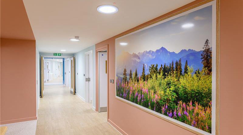
Colour can also help define different areas. A shift in tone between corridors, lounges and dining spaces can support a clearer sense of place. Carefully chosen contrast can make key destinations easier to recognise.
This can be particularly valuable in dementia-friendly design, where residents may benefit from clear, consistent visual cues. Bedroom doors, bathroom entrances or dining room doorways can be picked out in a shade that contrasts with surrounding walls, helping residents identify the spaces they use most often. The key is to use colour with purpose: avoiding overly busy schemes but still providing familiar cues that support confidence and independence.
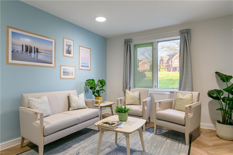
Bedrooms need particular care. These are personal spaces, so palettes should feel restful rather than overly stimulating, especially when paired with familiar furnishings and good natural light.
Supporting staff and visitors too
 A well-designed care home must work for everyone. Staff spend long shifts in these environments, and families or visitors may arrive feeling anxious or emotional.
Reception areas, family rooms and quiet lounges can benefit from composed palettes that make the building feel approachable from the moment someone enters. Muted greens such as Crown Paints’ Glass Green can bring a grounded, restorative feel. A gentle yellow such as Narrative can create a more uplifting atmosphere in spaces that need a little warmth or energy.
Staff areas should not be overlooked. A well-finished break area can provide a welcome contrast to busy operational spaces, using warmer shades or deeper accents to create a clearer sense of separation from high-traffic areas.
Balancing appearance with performance
In care homes, a successful scheme is not just about choosing the right colours. It is about choosing products that can keep those spaces looking good.
Corridors, lounges, dining rooms and bedrooms all experience regular wear, from knocks and scuffs to frequent cleaning. Durable, washable finishes can help maintain a fresh appearance for longer and support the maintenance programme.
Crown Trade Clean Extreme Scrubbable Matt is designed for demanding interiors where walls need to withstand repeated cleaning and retain a high-quality matt finish. It is well suited to busy communal areas where durability and appearance both matters.
In bathrooms, ensuites, kitchens and laundry areas, moisture and humidity also need to be considered. Crown Trade Clean Extreme Mould Inhibiting Scrubbable Matt combines a durable, washable finish with mould-inhibiting properties, making it a practical option for these more challenging spaces.
Woodwork and trim are just as important. Door frames, skirting boards, handrails and other high-contact surfaces need a finish that can cope with everyday use. Crown Trade Fastflow Quick Dry Satin and Crown Trade Fastflow Quick Dry Gloss provide durable options for interior woodwork. Their quick-drying formulations can also help reduce disruption during refurbishment works.
For areas where hygiene is a particular priority, such as treatment rooms or specialist spaces, Crown Trade Steracryl Anti-Bacterial Scrubbable Matt may also form part of the specification.
A considered approach
 The same principles apply across many care and healthcare environments: people respond better to spaces that feel human, considered and easy to spend time in. That does not mean making interiors overly decorative, but it does mean moving away from finishes and palettes that feel cold, clinical or impersonal.
Crown Trade’s work with Cygnet Kenney House in Oldham, a mental health hospital for women, reflects this approach. Colour was used as part of the wider design to create a more therapeutic, welcoming and non-clinical environment. The specification also needed to meet the practical demands of a busy healthcare setting.
For care homes, the lesson is clear. Colour, finish and durability should be considered together from the outset, so spaces not only look calmer and more inviting on day one but continue to feel well cared for over time.
When chosen carefully, tested in the space and paired with the right Crown Trade product specification, colour can help shape how a care home feels, functions and performs – supporting residents, reassuring visitors and making everyday maintenance easier for staff.
For more information about Crown Trade’s colour and specification support, visit: www.crownpaintsprofessional.com