Top Tips for Decorating Care Homes
![]() Andrew Cleaver, National Sector Manager for Healthcare at Dulux Trade, explains how designing care homes correctly can improve residents’ quality of life.
Andrew Cleaver, National Sector Manager for Healthcare at Dulux Trade, explains how designing care homes correctly can improve residents’ quality of life.
There are over 17,000 care homes in the UK1 and according to studies by building and construction market researchers AMA, “the demand for additional capacity within the care home market is likely to start rising again within the next couple of years2”. To support residents living with dementia, it is important that those developing or reinvigorating care facilities know the key design concepts that can aid wayfinding and independence.
Colour is critical
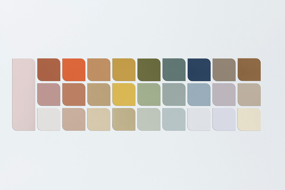
 While there is no right or wrong way to colour a healthcare setting, the shades used need to be carefully selected to ensure that critical surfaces – walls, doors, floors and ceilings – are all easily identifiable. This means choosing colours that are all 30 light reflectance value points apart. For example:
Main walls
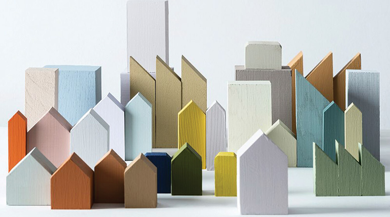
Soft, calm tones should be used on main walls. The calm hue of the Dulux Colour of the Year 2024, Sweet EmbraceTM, is a prime example. It is a subtle, serene standalone shade that makes bolder tones used on other critical surfaces stand out.
In addition, the Colour of the Year was launched alongside three complementary palettes. For bedroom and living spaces, look to the soft blues and greens in the Calm palette (such as Serene Waters or Fresh Foliage) that can help to create a positive, soothing environment for residents.
Feature walls
Feature walls should not just be added for visual interest, but to also aid wayfinding. Using more saturated hues – such as the warm terracotta and sand colours in the Warm palette, or modern ochres and lilacs in the Uplifting palette – at the end of corridors, behind kitchen serving areas, or at the front of the living room will act a clever visual prompt and help visually zone areas. A variety of these colours can also be used to visually differentiate each storey of a care home.
Doors
Bolder shades should be used on doors to make them more obvious against the softer tones of the walls. The deeper blues and greens in the Calm palette such as Sapphire Salute or Neptune Seas contrast well with Sweet Embrace™, while also remaining tranquil and easy on the eye.
On the other hand, staff-only doors and supply cupboards should be painted in the same colour as the walls, so they blend in, and limit prohibited access.
Floors
Floors are also considered a critical surface, and the design of these is just as important as the walls enclosing them. High sheen should be avoided, as it can make surfaces appear slippery, and reflect light, which can create confusing shadows. Bold patterns and stripes can also be disorientating, and make the floor feel unstable. In addition, contrast between flooring in one room to the next can appear as a step up or down – as this can be perceived as a hazard, so ensuring the flooring is a consistent tone is therefore crucial.
Other areas of consideration
Alongside critical surfaces, the furnishings of care homes should also be taken into account. They should contrast with critical surfaces so they can be quickly identified. Plus, furniture in a range of shapes and sizes helps increase the residents’ independence: variety provides choice and offers more options to suit needs and preferences.
Lighting should also be a consideration. With residents spending much of their time indoors, it is vital that lighting chosen helps stimulate and mimic sleep-wake cycles. Good lighting is also important in helping residents identify spaces and enjoy their everyday routines and activities, as well as reducing glare and shadows that can cause confusion.
The perfect paint
 While the choice of colours is critical to the wellbeing of residents with dementia, it is the type of paint that keeps the surfaces in the best condition for longer.
The 2024 Colour of the Year, and the shades in its corresponding palettes, can be selected for products across the Dulux Trade range of paints. This means that no matter the project, there is a paint and colour suitable for it.
When designing or redeveloping care facilities, consider a durable paint that will stand the test of time, and limit the disruption caused by potential future redecoration work. The recently reformulated Dulux Trade Diamond Matt is compliant with BS EN ISO 11998 Class 1 and BS 7719 Class C and can withstand 10,000 scrubs (the equivalent of five hours non-stop scrubbing). It also delivers additional resistance to oil-based stains, such as food or cosmetics, to help stop stains from being absorbed into the surface, making them easier to clean.
Healthcare environments could also be decorated with antibacterial paint. In such busy environments, fingers, liquids and vapours can often come into contact with walls, which can encourage the spread of germs. Reduce this risk by using a paint such as Dulux Trade Sterishield, which inhibits bacteria and reduces population of MRSA and E.coli, and, when combined with appropriate cleaning practices, helps achieve a more hygienic environment.
For more information about the Colour of the Year 2024, please visit www.duluxtradepaintexpert.co.uk/
en/colour-of-the-year-2024
For further information about designing for
dementia, please visit: www.duluxtradepaintexpert.co.uk/en/content/occd-hub