Surrey Care Home Installs Age-Busting Signs As It Looks To Reimagine Older Stereotypes
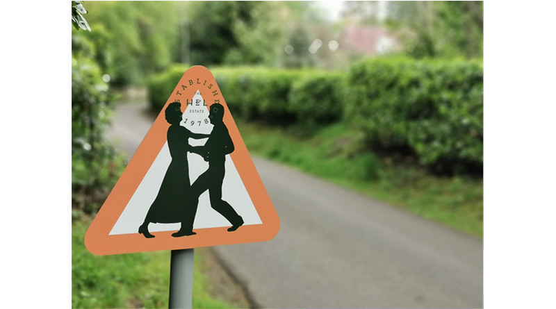
A Surrey care home has invested in a new set of signage in a bid to reimagine perceptions of older people – with traffic signs along its drive now depicting dancing couples, as opposed to the common image of stooped backed pensioners slowly crossing the road.
The Huntington & Langham Estate in Hindhead, which is made up of two specialist family-run care homes offering high-quality residential, nursing and dementia care, has replaced its previous signage to reflect the fact that age is no barrier to a joyful life.
With the estate accessed by a long driveway, the team wanted to create an early impression that would be seen on first arrival, which saw the signs commissioned to replace more traditional ‘elderly people’ signs.
The sign designs were inspired by the winning entry of a competition hosted by Centre for Ageing Better, which saw SwaG Design recreate the crossing sign with energy enthused older people. Running with the theme, the Huntington & Langham Estate opted for people dancing together to emphasise the energetic, jubilant lives enjoyed by many of those living on the estate.
Charlie Hoare, Director of the Huntington & Langham Estate commented: “Older people are all too easily pigeonholed as being frail, slow-moving and often simply weary of life. The truth is though that’s far from the case. In fact, if you had driven down our drive last week, you would have had to be mindful of dozens of people dancing in our car park during a lively outdoor concert. There’s no such thing as being over the hill when you have so much life left to live and we wanted to emphasise that.”
He continued: “We loved the sign examples that won the Centre for Ageing Better’s competition and wanted to pay tribute with our own versions here on our private road. They’re amongst the first things people see when travelling up our drive and we like to think it sets the tone for the rest of their visit, or indeed their residency, should they choose to live with us.”
The signs are reflective of the estate’s approach to how it envisions health and safety in general, which even applies to elements such as infection control and COVID. Within the homes themselves, the team look to apply an imaginative spin to create a more homely, resident-friendly effect. For instance, when it comes to the clinical hand washing signs, the team have adapted them to look like a picture in a frame, with the hand washing instructions bordering a black and white image from an old movie. This helps to take the clinical edge off the signs, whilst still conveying the necessary instructions.
Charlie Hoare added: “When you take a step back and reflect on your approach to care it helps to open up your mind to ways of adapting all sorts of things. It would be easy to simply take health and safety signs, print them out and put them up, thereby ticking the necessary boxes. The truth is though, whilst necessary in a care setting, people don’t have health and safety signs scattered around their homes under normal circumstances. By doing this, we look to ensure we deliver safe care but in a way that enhances a space rather than detracts from it, helping to create a truly homely environment.”
